The Hidden Power of Visuals: How to Sell Courses Without Words

Today we’ll talk about a familiar situation: you’ve created a deep, valuable course, but clients hesitate to buy. Why?
Often the answer lies in the visuals. They sell better than text. It’s simple: people make decisions emotionally and buy with their eyes. Even before a potential student reads your course description, their brain has already evaluated the “packaging.” Professional visuals instantly communicate quality and value. You don’t persuade — you show.
We live in a time when first impressions are formed in seconds. If the cover image, color palette, or even font doesn’t “click,” the user will simply scroll past. On social media, your website, or a learning platform, visuals become your silent sales manager. They either create a sense of trust and expertise or, on the contrary, signal that something feels off.
Think about how you choose a course yourself: beautiful design, a clear instructor photo, harmonious colors — all of this subconsciously speaks of professionalism. People associate quality with aesthetics. If the visuals look well thought out, the brain automatically assumes, “The content must be just as good.”
That’s why course design isn’t a decorative detail but a strategic sales tool. It helps convey the learning atmosphere, highlight the author’s style, and build trust even before the first click on the “Buy” button.
In this article, we’ll explore how to create visuals that replace long descriptions, evoke emotion and inspire action.
Judged by the Cover
Your cover is the first impression. Invest in professional design so your course looks as high-quality as its content.
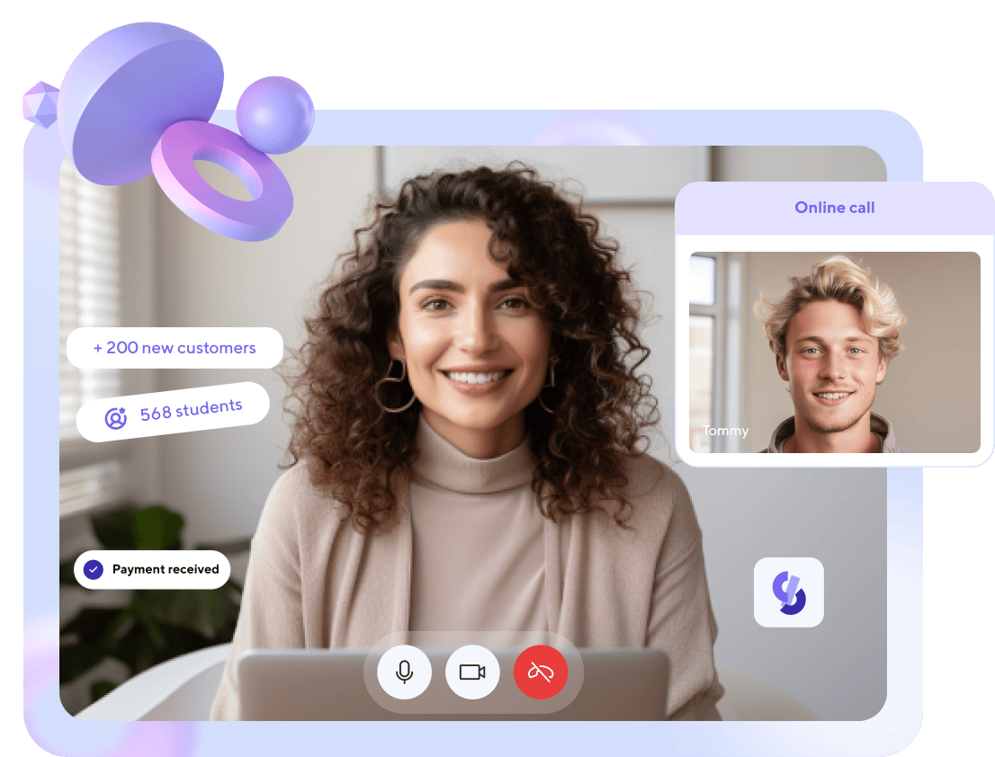
A cover is not just a picture. It serves as the storefront of your educational product. If you compare a course to a book, it’s the cover that makes someone open the first page. In online learning, this moment lasts only seconds: users see dozens of options and choose the one that looks appealing, professional, and trustworthy.
High-quality visuals send a signal: “This is serious work.” They subconsciously communicate that the course creator has invested time, energy, and attention into their product. People sense this — and respond with trust. On the other hand, cheap stock photos, random colors, or careless typography create the opposite impression, even if the content itself is strong.
For a cover to work, it must not only “look nice” but also match your brand and course theme. For example, if you teach mindfulness or yoga, too many bright colors or sharp contrasts may confuse. In this case, choose soft tones, clean lines, and a sense of space. But if it’s a storytelling or marketing course, you can add energy, bold accents, and dynamic composition.
Practical Tips for an Effective Cover
- Focus on the human face. A photo of the author or a student representing the target audience helps create an emotional connection.
- Use color consciously. Colors influence perception: blue is linked to reliability, yellow to positivity, green to balance. Choose a palette that reflects your course’s essence.
- Typography matters. Avoid overly decorative fonts. A simple, readable font builds more trust.
- Leave space. Don’t try to fit everything — logo, text, images, icons. A design that “breathes” looks confident.
- Test different options. Even a small change in background or image can affect conversion. Run a short A/B test on your course page or social media.
A good cover is an investment in how your brand is perceived. It helps your course “speak” to the audience before you say a word. And that’s the first step to selling not through words but through aesthetics.

Show, Don’t Tell
Turn a complex paragraph into a simple infographic or a short video. This shows that you value your client’s time and make learning easy.
The human brain processes visual information thousands of times faster than text. That’s why when a potential student sees a short visual instead of a long description, they not only understand faster but also start to trust more. Visuals create a sense of transparency: “Nothing is being hidden from me, everything is explained clearly.”
Think about what you can show instead of describing. If your course has a complex structure, create a clear learning roadmap. If the topic is result-oriented (for example, a course on design, copywriting, or financial literacy), show “before and after” examples. And if you want to convey the learning atmosphere, a short video preview with lesson clips or behind-the-scenes shots creates a sense of presence.
Visual formats not only save time but also add value to your product. A well-designed infographic can replace an entire page of text, explaining a complex concept at a glance. A short 30–40-second video can sell better than a long description because it lets viewers see real emotions, the instructor’s tone, and their teaching style.
Practical Ideas for Implementation
- “Student Journey” Infographic. Show how the learning progress looks from the first module to certification.
- Short Intro Video. 10–15 seconds where you explain who the course is for and why it’s valuable.
- Visual Blocks in the Course Description. Instead of long text, use icons with short phrases: “8 practical lessons,” “mentor support,” “lifetime access.”
- Animations or GIFs. Movement always attracts attention and holds it longer than a static banner.
When you show instead of tell, you remove the barrier between your content and the user. The person doesn’t need to make an effort to understand — they simply feel, “This will be easy for me.” And that feeling sells better than any text.
Real Proof Beats a Quote
Ask your students to record a short video testimonial. Real faces and genuine emotions sell ten times better than any text.
People trust people. It’s a simple truth that works flawlessly in visuals. Even the most sincere written review can’t convey tone, eye contact, or genuine emotion — the things that make it feel authentic. When a potential student sees a real person sharing their experience, they subconsciously imagine themselves in that person’s place. That’s when trust is born.
A short video isn’t an ad — it’s proof. You don’t need a big production: just good lighting, a calm background, and honest words. The best testimonials sound natural. Don’t ask students to read a script; instead, give them a few guiding questions:
- What was the most valuable part of this course for you?
- How did your work or mindset change after the training?
- Who would you recommend this course to and why?
Such answers sound genuine and create a much deeper effect than any “perfect” quote on a banner.
A Few Practical Tips
- Vertical video format is ideal for social media. Short clips under one minute work great in Reels or Stories.
- Create a testimonial compilation. Several different stories in one video show that your course helps people from various backgrounds.
- Add captions or subtitles. Many people watch videos without sound, so this helps keep their attention.
- Don’t fear imperfection. A slightly amateur video looks more authentic than a perfectly edited promo.

Real faces, genuine voices, and emotions create an effect that can’t be faked. This is social proof in its strongest form. When real students share their stories, the potential buyer isn’t reading an ad — they’re seeing results.
The Presence Effect
Show behind-the-scenes photos or videos of your course creation process. This builds trust and turns an ordinary product into a personal brand.
What happens behind the scenes is always more interesting than what’s on stage. People want to see not only the perfect result but also the journey behind it — the process, the details, the atmosphere. In a world where everything is polished to perfection, authenticity has become a luxury. That’s why behind-the-scenes content builds trust much faster than a flawless promo image.
A photo from a shoot, a short editing clip, or a moment where you’re preparing to record a lesson — all of this creates a sense of presence. The viewer sees that a real person, not a faceless brand, is behind the course. And when this sense of genuine connection appears between you and your audience, the sale happens almost naturally. People don’t just buy a product — they buy a piece of your story.
These moments don’t need to be staged. On the contrary, a bit of imperfection in the frame is a plus. Instead of hiding the working chaos, show it. Show how you test the microphone, laugh during recording, or sketch out the structure of a future lesson. This adds humanity and creates a sense of closeness that no text can convey.
How to Create a Strong Sense of Presence
- Tell a story through visuals. For example, show the journey from idea to course launch — from notebook sketches to the final video.
- Use short videos or stories. Just a few seconds of behind-the-scenes footage make viewers feel like they’re “there with you.”
- Avoid over-editing. Authenticity lives in the details — natural reactions, real light, background sounds.
- Add context. Captions like “this shot is from module three” or “testing a new practice format” help the viewer feel involved.
These visuals aren’t just social media content — they’re the foundation of your personal brand. When your audience sees you working, experimenting, and putting your heart into the process, they start to see you not just as an instructor but as a person they can trust. And that trust sells better than any advertisement.
Product Test Drive
A potential student evaluates not only the course content but also the overall learning experience. If they don’t understand how the process works — where materials are stored, how to take lessons, or how to ask the instructor questions — a barrier appears in their mind: “Will I be able to handle this?” That’s why a short video tour isn’t just a promo tool but a way to ease anxiety.
Show people what awaits them after purchase. Record your screen, open the course, and give a quick walkthrough: where to find the first lesson, how the module structure looks, how to track progress, earn a certificate, or contact a mentor. This creates transparency and demonstrates that you’re not hiding anything — you’re inviting them into your space.
A Few Tips to Make the Video Tour Effective
- Be as specific as possible. Don’t just talk vaguely about “convenience” — show it: “Here’s the button for downloading additional materials,” “Here’s where you can leave a question under the lesson.”
- Highlight details that enhance the feeling of quality. For example, a clean interface, intuitive menu, pleasant page design, or mobile-friendly layout.
- Speak in simple terms. People don’t want technical jargon — show that even a beginner can easily use the platform.
- Keep it under two minutes. That’s enough to communicate the essentials without overexplaining.
The bonus effect of a video tour is that the person already imagines themselves as a course participant, navigating a familiar interface, and mentally moves closer to the decision to buy. It’s like a car test drive — once you’ve sat behind the wheel, it’s much harder to walk away.
By showing the platform from the inside, you don’t just demonstrate convenience — you build trust and confidence. And confidence that everything is simple and clear removes the biggest barrier to purchase.
—
When your visuals are thoughtfully crafted, they work better than dozens of marketing arguments. Before a person even reads the course description, they can already feel that it’s a high-quality, professional product. This isn’t magic, it’s the psychology of perception: we trust what looks coherent, confident and detail-oriented.
This approach lets you sell at a higher price without mentioning cost. Because people don’t just buy knowledge — they buy an experience, an emotion, an atmosphere. Visuals create that experience before the purchase even happens: they communicate your standards, your values and your attitude toward your audience. That’s why the aesthetics and structure of your page, the cover, photos, videos and even colors matter just as much as the course content itself.
In a world where anyone can create an online product, those who win aren’t the ones who shout the loudest but the ones who show the deepest. And if your course is designed with care for first impressions, with attention to emotion and trust, it will start selling long before you say a word.
Articles are good, but social media posts are faster!
Subscribe to us and be the first to receive tips and tricks
on promoting your online school!


Earn money on your knowledge and experience with
Softbook!
to the platform for setting up your own school!